Role: Lead Product Designer · Global Player App
Team: Agile Squad - Product, Design & Development
Duration: 9 months
lead product designer
ui design
accessibility
final designs
Responsive, on-brand, and editorially flexible.
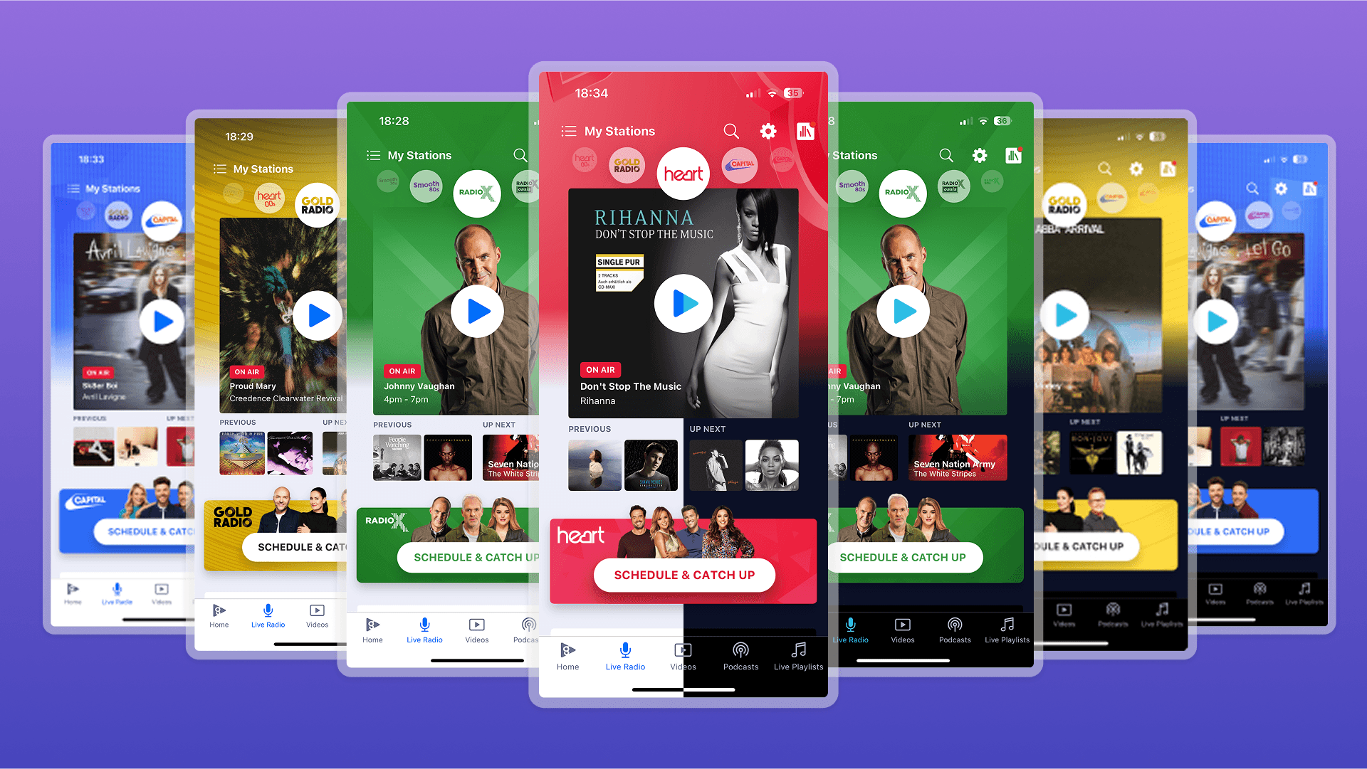
These screens shows our new live radio UI in action across Global Player station in both light and dark themes.

The Problem
The Live Radio screen was the last holdout from our legacy app experience. It is much loved by users, but increasingly difficult to maintain and navigate as the business expands their live radio station offering.
It missed accessibility standards, wasn't scaling well across brand styles, and the content update process was extremely limited for editorial teams with minimal control over. We needed a modern, flexible solution that preserved its core charm, while enabling better performance and future-proof capabilities.
This screen shows our OLD live radio UI in action for Gold Radio. You can see clear contrast failures with the Brand colours on this screen.
The Fix
We replaced the rigid, hard-coded legacy layout with a modular, fully responsive design. Key improvements included:
Scaleable UI: The Live Radio tab now reflect the new app block styles, adopting our Global Player design system while still representing 9+ unique station branding identities.
A redesigned screen UI:
Designed with reusable components, improved visual hierarchy, and performance optimisation.
Mobile and dark mode optimised: Seamless rendering across all devices, anytime.
Accessibility & performance improvements:
Fixed inconsistent tap targets, added full voiceover support, restructured layout to meet WCAG standards, and optimised image loading and layout logic—resulting in faster load times and smoother screen interactions.
The impact
We're still collecting engagement data. In the meantime, the internal impact has been monumental and overall the UI update and editorial flexibility has been well recieved. Here are current success metrics:
Unlocked +100% editorial efficiency:
Teams can now update content and visuals in real-time, without relying on dev tickets, scaled across 35+ stations.
30% faster UI load times:
Thanks to leaner architecture, design system tokens and component reuse, the new live radio tab loads quicker than ever.
Unified user experience & Improved Accessibility:
This was the final legacy screen to be migrated, bringing consistency across the full app.
Internal audits showed a significant improvement across contrast, navigation and tap interactions.
Thanks for reading!
Full case study coming soon.
